ESReality - Where Gaming Meets Reality
Not Logged In | Login | Register
05:11 CDT - 1161 users online
All Posts
HoQ CTF League (2 comments)
Posted by artemis4 @ 10:56 CDT, 19 April 2024 - iMsg
Greetings,
House of Quake will hold a Capture the Flag League starting in early May. This is a new edition of a well-established competitive game mode and we would love as many hands on deck as we can!

Region: EU

Map pool: Spider crossings, Japanese Castles, The Dukes Garden, Ironworks, Troubled Waters, Infinity, Courtyard

Format: TBD

Teamsize: 5

For those who are interested, I would invite you to join the House of Quake discord server where there is an ongoing discussion in the CTF-league channel regarding the exact league format - forming the teams (self-initiating or draft), tournament format (Swiss format, Double round robin) and other possible settings.

There are ongoing negotiations with sponsors, but as of far, there is no prize pool.

On Thursday, 25th of April, there will be a final announcement of the league's format. Registration opens this Sunday and will close on the 28th of April. Until then, I invite you to join the discord and help us with the decision!


Links: House of Quake discord server, CTF-league channel
Edited by Lam at 05:42 CDT, 20 April 2024 - 281 Hits
Is Rapha Asian? (6 comments)
Posted by clitsucker @ 15:13 CDT, 17 April 2024 - iMsg
I mean just look into his eyes.... no homo!
433 Hits
I did it guys (4 comments)
Posted by gSTRUCTOR @ 20:54 CDT, 15 April 2024 - iMsg
Born, grew, had kids and before dying, whenever it happens, i can die happy now.


long live quake brothers, im playing QL duel every night with couple friends and enjoying it like its 2010.

thanks

btw cooller stream now with cam and cool blue lighting woohoo (RickFlair.gif)
Edited by gSTRUCTOR at 21:04 CDT, 15 April 2024 - 541 Hits
Day One (9 comments)
Posted by czm @ 12:07 CDT, 15 April 2024 - iMsg
Got some weird skin thing on my knee, should I get it checked out?

Also wasn’t it cool back when we just hit a few keys in a row to communicate in game via text? Pretty sure that’s what I spent most of my time thinking about while getting driven home from middle school

But back to the skin issue. Think it’s related to this time I fell in that gravel parking lot in Neely, Alaska while running in flip flops and scraped my knee real bad. Not sure tho, cuz that was like 18 years ago
424 Hits
My 2nd PQL frag movie (4 comments)
Posted by Maga-pql @ 10:34 CDT, 5 April 2024 - iMsg

0 1 2 3 4 5 6 7 8 9 10
Rating: 8 (3 votes)
Don't take your girl to the cinema, better save money and check the tape:
Youtube
Edited by Lam at 12:57 CDT, 8 April 2024 - 581 Hits

<< Comment #1 @ 15:50 CDT, 9 September 2015 >>
Am I rite that this site isn't tied to anybody having a financial interest of any kind, thus being likely to mess with the content in odd ways? If so it deserves to be kept alive, much like a beautiful species that is about to go extinct.

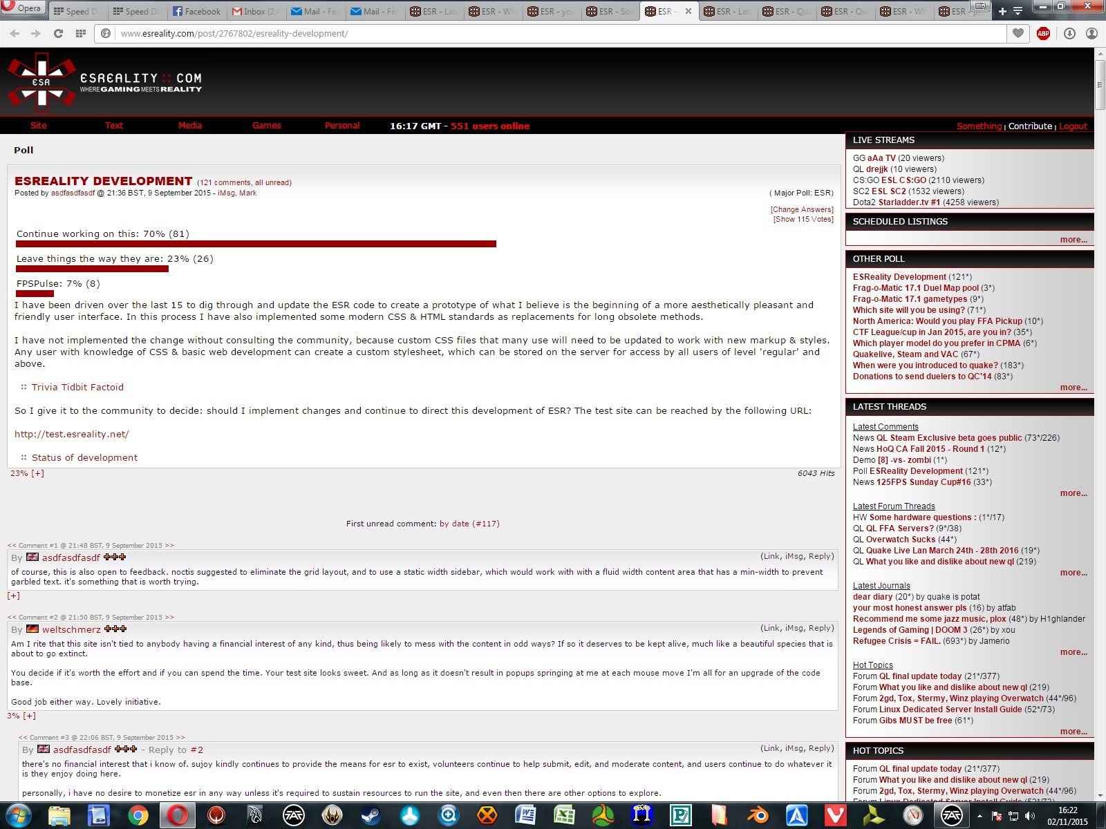
You decide if it's worth the effort and if you can spend the time. Your test site looks sweet. And as long as it doesn't result in popups springing at me at each mouse move I'm all for an upgrade of the code base.

Good job either way. Lovely initiative.
<< Comment #2 @ 16:48 CDT, 9 September 2015 >>
By United Kingdom Devianthe 
The only things that I'd get rid of are the rounded borders in panels to the right. They aren't as visible in the current version but really stand out in the new one. Also shadows and drop shadows of any kind.

inb4 much flat design
Edited by wrekt at 16:57 CDT, 9 September 2015
<< Comment #13 @ 22:08 CDT, 9 September 2015 >>
By Portugal ProT  - Reply to #2
What this guy said. ^

Also, there's too much empty space around the sidebar blocks and a bit too much between comments, IMO.

Other than those details, it's looking good. Keep it up. :)

Edit: Pluses look terrible, btw.
Edited by ProT at 22:10 CDT, 9 September 2015
<< Comment #15 @ 22:11 CDT, 9 September 2015 >>
By Transparent cumrag  - Reply to #2
shadows are gay
<< Comment #3 @ 17:13 CDT, 9 September 2015 >>
By bloody eyeball by hatelull melechesh 
Good initiative, but as Gary whatever said in the movie Soldier, "If it ain't broke, don't fix it".

This is regarding the UI of course. There is nothing wrong with the classic look and it has aged superbly (and I still borrow from it's structure on my own websites to this day).

Any work should be on the back end or minor UI functionality improvements.
<< Comment #38 @ 08:02 CDT, 12 September 2015 >>
By frozen Freiya  - Reply to #3
This.
<< Comment #4 @ 17:23 CDT, 9 September 2015 >>
By yesh its SEAN CONNERY! megaman3 
All that sounds nice, but people are hardly going to use those features.
<< Comment #5 @ 17:36 CDT, 9 September 2015 >>
By Poland aiken 
Can you keep old site logo or at least the part with X-like logotype, ESReality and "Where gaming meets reality"? You can refresh it if you like but the general concept of the logo doesn't have to be simplified to Web 2.0 flavor.
<< Comment #6 @ 18:21 CDT, 9 September 2015 >>
By MLP_FlutterShy Teen Queen  - Reply to #5
Logo is a placeholder, who knows what the dirty minds can come up with when it comes to designing a new one
Edited by Teen Queen at 19:27 CDT, 9 September 2015
<< Comment #7 @ 18:24 CDT, 9 September 2015 >>
By Italy qwih 
We already have people like hitsu and u wanna lower the entry barrier even more? This is not sweden brandan
<< Comment #9 @ 18:43 CDT, 9 September 2015 >>
By USSR Demiurge  - Reply to #7
our head admins are very sensitive, having accumulated lots of bittersweetness over the years, like a bad wine, so try to be gentle about any disagreements and feedback you're trying to convey
Edited by Demiurge at 18:51 CDT, 9 September 2015
<< Comment #8 @ 18:30 CDT, 9 September 2015 >>
Looks good. The new look has my vote.
<< Comment #10 @ 19:46 CDT, 9 September 2015 >>
By Germany yank3 
the letter spacing on the right preview looks kinda too high opposed to the intention of "giving a condensed overview" (take esreality.com for an example, it is a gaming site mainly for quake and they have a nice layout to get your POI)

background looks too bright, especially with the glow around the posts, mmight be just me or YOU might tweak it

but yes, esr could need a FORCED lifting
Edited by yank3 at 19:49 CDT, 9 September 2015
<< Comment #11 @ 20:49 CDT, 9 September 2015 >>
By US-Colorado zaggs 
Long over due... How about mobile compatibility?
<< Comment #12 @ 22:07 CDT, 9 September 2015 >>
By United States of America Lorfa 
One gripe I have is that ESR fits in the window on my low res, whereas it doesn't in the new one. Could it test for res or window size or something and fit things accordingly, or ?
<< Comment #14 @ 22:09 CDT, 9 September 2015 >>
By Transparent cumrag 
the orange text on light gray background is hard to read.

don't like the blurred border of the comments or gay glow for new comments.
<< Comment #16 @ 22:40 CDT, 9 September 2015 >>
By rammstein *deotrip butcher_kgp 
<< Comment #17 @ 02:16 CDT, 10 September 2015 >>
By SQUAD cityy 
Looks good, keep it up.

I would replace the site heading (e.g. Latest news, News, ...) with breadcrumbs. They should have the same height as the float:right menu holding "show all · show threads · edit category filters
Latest News".

Live stream box is missing I think. Also the right side navigation menu ist missing in the forum view.
<< Comment #18 @ 02:18 CDT, 10 September 2015 >>
By SQUAD cityy  - Reply to #17
Oh and most importantly: Add some css rules for galleries and embedded pictures please.

Edit: And make everything responsive for mobile view while you are it it please :-) :-) :-)
Edited by cityy at 02:18 CDT, 10 September 2015
<< Comment #19 @ 02:26 CDT, 10 September 2015 >>
By ._o filo  - Reply to #18
how to fully occupy a volunteer time, make this site responsive :P
Edited by filo at 02:27 CDT, 10 September 2015
<< Comment #20 @ 02:58 CDT, 10 September 2015 >>
By ._o filo 
I did some small tweeking with the css and i am intentionaly pasting the 1:1 screenshot so you can take a detailed look of borders margins, slight color changes in text; no more pure black or white.

I would also add to my design, spacing between character to tittles"schedule listings" and so on. And add 1px border #666 under tittles aswell

Also smaller font for 10-15% in the side boxes.

So here goes:
  • Attached Image: 106809-esr_HQ.jpg (601KB)
  • Edited by filo at 03:39 CDT, 10 September 2015
    << Comment #21 @ 05:35 CDT, 10 September 2015 >>
    By Croatia Meph1stoo  - Reply to #20
    this looks very good, nice job
    << Comment #22 @ 06:26 CDT, 10 September 2015 >>
    By ._o filo  - Reply to #21
    who knows maybe Brandan and the community will like it... if he wants i can help.
    << Comment #24 @ 07:16 CDT, 10 September 2015 >>
    By Germany weltschmerz  - Reply to #20
    Your side boxes bg color appears to be darker than on the test page, which is good. Right now, the orange text is bold with me, but not bold and a lighter background make the text hard to read (at least on my screen).

    Still, I thought the main benefit of brandan's effort - if I understood him correctly - was that the site could uniformly be styled through CSS once he's done. So the ergonomic fine tuning would then merely amount to final polishing, no?
    << Comment #25 @ 07:28 CDT, 10 September 2015 >>
    By ._o filo  - Reply to #24
    ye i made bg color of sideboxs match the color of the page header, so it has more connected feel to it, i also made the sign-in bar a little more darker aswell.

    ... if you noticed i also used the shadows but instead of hard look, they are realy soft, just so you know they are there, but you dont realy take notice. And to soften the page further making the fonts dark gray and not black and not white but soft gray helps alot + you have colors black and the white reserved for more important akcents on the visual hierarchy.
    << Comment #26 @ 09:32 CDT, 10 September 2015 >>
    By Germany weltschmerz  - Reply to #25
    I did notice. No hard edges but you didn't go for a blatant, into-your-face 3D look either (which is usually distracting). Fine piece of work.
    << Comment #23 @ 07:13 CDT, 10 September 2015 >>
    By Cheese M1zzu 
    - less padding, less whitespace
    - the current design has more hard edges and purely black areas. I like those.
    - In the current sidebar, the links are bold. Can someone test this?
    - not a fan of the orangy borders in the comments either.

    I'm heavily biased towards the current design.
    << Comment #27 @ 10:34 CDT, 10 September 2015 >>
    By United States of America T1E 
    P
    << Comment #28 @ 12:04 CDT, 10 September 2015 >>
    By Uruguay gSTRUCTOR 
    I love the classic style, hoping it stays optional if a new style is adopted.

    About test.esreality.com first thing i dislike are on the right panel, the fonts are bigger, the space between letters is bigger, and it looks disconnected compared to current one.
    << Comment #29 @ 13:09 CDT, 10 September 2015 >>
    By Brazil _agu 
    I like the things they are.
    << Comment #30 @ 13:33 CDT, 10 September 2015 >>
    By US-Colorado zaggs  - Reply to #29
    "Change scares me."
    << Comment #31 @ 13:44 CDT, 10 September 2015 >>
    By Brazil _agu  - Reply to #30
    it is working, why change it? and i also like the website's design and so on. :0
    << Comment #32 @ 14:05 CDT, 10 September 2015 >>
    By Cheese M1zzu  - Reply to #30
    so what you're saying is that we should all play call of duty?
    << Comment #33 @ 16:48 CDT, 10 September 2015 >>
    By US-Colorado zaggs  - Reply to #32
    im sure this makes sense somehow...
    << Comment #34 @ 22:22 CDT, 10 September 2015 >>
    By Canada andysak 
    Please implement Flash.
    << Comment #35 @ 22:31 CDT, 10 September 2015 >>
    By Canada FlashSoul  - Reply to #34
    Nah, let's go with some java applets.
    << Comment #37 @ 09:05 CDT, 11 September 2015 >>
    By SC_Zerg [mash]  - Reply to #34
    I don't think he's available.
    << Comment #36 @ 05:17 CDT, 11 September 2015 >>
    By QW tbone 
    I think it looks awesome, only thing I don't like is the orange glow around the comments. Runs pretty fast already too.
    << Comment #40 @ 03:29 CDT, 15 September 2015 >>
    By Dird's Xmas tree ;o Dird  - Reply to #36
    this...someone higher up suggested it was for new comments only but seems to be all? would be OK if it was just for new/unread comments

    Latest threads too low down. "Other News" and "Latest Coverage" low priority imo

    But I like the front page styling...maybe change the title e.g. "Latest News" to be a bit bigger
    << Comment #39 @ 08:13 CDT, 14 September 2015 >>
    By Latvia Tripleight 
    Don't be such wusses, move on to new things.

    Hail to the new changes.
    << Comment #41 @ 06:15 CDT, 15 September 2015 >>
    By ._o filo  - Reply to #39
    .
    Edited by filo at 06:16 CDT, 15 September 2015
    << Comment #42 @ 10:00 CDT, 15 September 2015 >>
    By MLP_FlutterShy Teen Queen  - Reply to #41
    4MB gif = no

    based xou
    << Comment #43 @ 10:36 CDT, 15 September 2015 >>
    By Austria noctis  - Reply to #42
    4MB gifs are welcome on pf :D

    (Preview image is shown with a play button overlayed and size info below)
    << Comment #44 @ 11:28 CDT, 15 September 2015 >>
    By MLP_FlutterShy Teen Queen  - Reply to #43
    * N U K E D *
    << Comment #48 @ 13:33 CDT, 16 September 2015 >>
    By ._o filo  - Reply to #44
    nice feature form pf :)

    ... hah take that esr :>
    << Comment #55 @ 11:44 CDT, 18 September 2015 >>
    By BBC skulp  - Reply to #43
    Kreygasm
    << Comment #45 @ 14:43 CDT, 15 September 2015 >>
    By Bulgaria melba 
    I use the Orange+ theme on a very dark monitor, I like the contrast and how simple it is. Shadows have always felt like a cheap trick, distract me and make things look blurry. I don't like having to click on the top right menu.
    << Comment #46 @ 08:14 CDT, 16 September 2015 >>
    By ._o epicus147 
    I think its a good initiative, here are some ideas, inputs and other stuff:

    -as others have stated the orange outline is a little too much

    - the plusses look a bit clunky, i think i get that feel about the whole site-- for me it kinda feels and looks heavier and slower then the old design

    -from the old design i liked that you could hover over the top right menu with site text media and games and it would drop down and then you could click on where you wanted to go, now you have two clicks, thats slower

    -i dont like that the logo at the top is so small, cause thats the one i click when i want to get back to the start page

    -biggest complaint i have is that the right side with the polls and whatever is so big. I think i see the problem similair to how plsuforward was criticized at some point, that this huge side with nothing takes focus away from the text and after all esr is very text heavy

    thanks
    << Comment #47 @ 10:03 CDT, 16 September 2015 >>
    By yesh its SEAN CONNERY! megaman3 
    Phone support pretty please.
    << Comment #50 @ 19:46 CDT, 16 September 2015 >>
    By bloody eyeball by hatelull melechesh  - Reply to #47
    You mean like ... "Welcome to ESR hotline! My name is Brandan, how can I help you?"
    << Comment #49 @ 16:57 CDT, 16 September 2015 >>
    site desperately needs a delete/reset user function, pretty basic functionality
    some people have literally been on this site for over half their entire lifetime and not every 30-year-old is thrilled about what their 15-year-old self wrote (nor have time to go through and "."-edit 15 years worth of posts and change nick and wait for however long it takes to completely disassociate with the previous nick, shit's beyond archaic)

    nice test site though, maybe a bit much empty space between columns (seems like wasted space compared to tight current layout) otherwise feels modern and nice, i'd use it
    << Comment #56 @ 02:36 CDT, 19 September 2015 >>
    By Slovenia Slajer  - Reply to #49
    no
    That would only be an additional incentive for horrible people to post crap believing they're anonymous and that their actions have no consequences for the future.
    << Comment #59 @ 03:21 CDT, 19 September 2015 >>
    By United States of America T1E  - Reply to #49
    .
    Edited by T1E at 03:21 CDT, 19 September 2015
    << Comment #62 @ 05:48 CDT, 21 September 2015 >>
    By inuyasha8 sonic  - Reply to #59
    T1E!!!!!!!!
    << Comment #51 @ 01:55 CDT, 17 September 2015 >>
    By Australia grembel 
    From an seo perspective the site is not good.

    For every thread, every post seems to generate its own page with identical content. All of these are not indexed.

    Randomly:
    intitle:"video about competitive trackmania" esreality

    Make sure to click "include omitted results".

    http://www.esreality.com/post/2760829/re-vide...rackmania/
    http://www.esreality.com/post/2760841/re-vide...rackmania/
    http://www.esreality.com/post/2759629/re-vide...rackmania/
    http://esreality.com/post/2759611/re-video-ab...rackmania/

    And so on. These are the same.

    Outside of the URL every page content is identical. This is terrible practice from content duplication perspective.

    Found this looking for duplicate domains.
    www.esreality.com
    esreality.com
    xsreality.com
    test.esreailty.net

    This has over 150 pages indexed for the exact same thing.
    intitle:"REFUGEE CRISIS = FAIL" esreality

    Also add <h1> tags. thanks!
    << Comment #52 @ 02:48 CDT, 17 September 2015 >>
    By bloody eyeball by hatelull melechesh  - Reply to #51
    BY JOVE HE'S GOT IT!

    1. Optimize ESR's seo like a mad cunt
    2. Fill the site with a load of Quake guides and resources for newbies
    3. Get ESR to the front page of Google for anyone searching for anything Arena Deathmatch related
    4. ????
    5. PROFIT!

    Quake saved. Not even kidding, it would actually be a considerable source of new players, just need a filter to hide muslim immigration & drug lord topics from unregistered users.
    Edited by quake is potat at 02:49 CDT, 17 September 2015
    << Comment #53 @ 07:37 CDT, 18 September 2015 >>
    By Croatia Meph1stoo  - Reply to #52
    Its been a while since I agreed with someones entire post
    << Comment #57 @ 02:46 CDT, 19 September 2015 >>
    By Australia grembel  - Reply to #51
    Are you two serious? Do you want more details or are you taking the piss.
    << Comment #60 @ 05:32 CDT, 19 September 2015 >>
    By bloody eyeball by hatelull melechesh  - Reply to #57
    No, I fully agree. Google doesn't like duplicated content on different URLs but it does love H1s.
    << Comment #83 @ 06:17 CST, 2 November 2015 >>
    By wc3_undead mammon  - Reply to #51
    SEO is so 1998
    << Comment #54 @ 08:40 CDT, 18 September 2015 >>
    By CNN Ryan2015 
    I voted to continue but i wonder...how do you improve greatness?
    << Comment #58 @ 02:46 CDT, 19 September 2015 >>
    By Slovenia Slajer 
    I'm honestly pretty happy with the way ESR looks now.
    But that is the result of visiting this site since the XSR days. so i know my opinion might be biased.
    As mentioned a few times already.. the only thing really missing is the mobile friendly version.


    But since we're on the development subject.. i'm using NoScript so every time you add a new outsourced web API (or there is a url update of an existing one) i have to go thru the list of currently blocked sites to find the one that is needed to have the same functionality as before.
    << Comment #61 @ 16:19 CDT, 20 September 2015 >>
    By Bulgaria cha0z_ 
    I like how it's shaping and defo vote to continue the work. After all it's 2015 + the design is refreshed, not changed drastically.
    << Comment #63 @ 10:18 CDT, 22 September 2015 >>
    << Comment #64 @ 10:22 CDT, 22 September 2015 >>
    By MLP_FlutterShy Teen Queen  - Reply to #63
    Yep, here goes nothing.
    << Comment #66 @ 16:38 CDT, 22 September 2015 >>
    By Portugal ProT  - Reply to #63
    ESR becoming Game of Thrones: Everyone gets banned.
    << Comment #68 @ 06:01 CDT, 23 September 2015 >>
    By Dird's Xmas tree ;o Dird  - Reply to #66
    coup by twista
    << Comment #67 @ 18:20 CDT, 22 September 2015 >>
    By bloody eyeball by hatelull melechesh  - Reply to #63
    Don't worry, he's just inspecting the brand new Supermax prison wing first hand, needs to spend a few nights in one of the cells to get a true feel of the place and make sure everything is working as intended.

    A man's admin.
    << Comment #69 @ 06:02 CDT, 23 September 2015 >>
    By Dird's Xmas tree ;o Dird  - Reply to #63
    banned for being his own buddy...kinda harsh =(
    << Comment #70 @ 11:58 CDT, 23 September 2015 >>
    i'm not planning to stop development.
    << Comment #72 @ 04:27 CDT, 25 September 2015 >>
    By Croatia Meph1stoo  - Reply to #63
    does anyone have any info on why he was banned?
    << Comment #73 @ 05:45 CDT, 25 September 2015 >>
    By Austria noctis  - Reply to #72
    He set himself to banned as far as i know.
    << Comment #74 @ 05:48 CDT, 25 September 2015 >>
    By Croatia Meph1stoo  - Reply to #73
    ah ty
    << Comment #78 @ 08:18 CDT, 28 September 2015 >>
    By United States of America T1E  - Reply to #74
    It's not the first time for the director.
    << Comment #77 @ 15:22 CDT, 26 September 2015 >>
    By Portugal ProT  - Reply to #73
    Shot himself right in the head. :(
    << Comment #65 @ 16:28 CDT, 22 September 2015 >>
    By Quake 3 (black) Kapiter 
    Candid question: will it be possible to have a "classic layout" available at start and keeping ESR just like it is now for anyone reluctant to change ? :)
    << Comment #71 @ 19:43 CDT, 23 September 2015 >>
    By Croatia Venser 
    I like the current design way better.
    << Comment #75 @ 12:50 CDT, 25 September 2015 >>
    By Unset amOKchen 
    Feels as if there is a bit to much light to me.
    I would like this if it tried to match the colors of the current site.
    << Comment #76 @ 10:27 CDT, 26 September 2015 >>
    By Germany yank3 
    force push please,

    and autoba(h)n haters.
    Edited by yank3 at 10:27 CDT, 26 September 2015
    << Comment #79 @ 01:51 CDT, 29 September 2015 >>
    By VIP tath 
    I hate 'modern' sites design like fps pulse - hard to navigate. ESR is aesthetic and intuitive to use. The only thing from layout i would change is the font to be more softer (~myriad or something similar) and expand main menu.
    << Comment #80 @ 06:24 CDT, 29 September 2015 >>
    By United Kingdom AnthonyJ 
    Something seems to be quite borked on test.esreality.net - many threads aren't showing the majority of their comments (like the way I can currently only see 3 comments in this one...).
    << Comment #81 @ 18:37 CDT, 7 October 2015 >>
    By USA_UK Jamerio 
    Unless you're going to turn the POST button into a titty, so when you submit the post, milk squirts all over the screen and dribbles down, to reveal your post, I think I'm good.
    << Comment #82 @ 08:26 CDT, 15 October 2015 >>
    By Russia johnny83 
    Please don't change it to this, you manage to spoil pretty much everything.
    << Comment #84 @ 10:22 CST, 2 November 2015 >>
    By Scotland Something 
    The fuck?

    Just use the mozilla firefox red theme, it looks so, so much better than default or even your modified one.

    Why go to all this work when there is an immediate, easy solution?

    Edited by Something at 10:22 CST, 2 November 2015
    << Comment #87 @ 12:07 CST, 20 November 2015 >>
    By ._o filo  - Reply to #84
    you know something john snow.
    << Comment #88 @ 16:00 CST, 20 November 2015 >>
    By Scotland Something  - Reply to #87
    Do I get back-stabbed now?


    PLEASE NO DON'T HURT THE SNOW
    << Comment #89 @ 16:57 CST, 20 November 2015 >>
    By ._o filo  - Reply to #88


    ... nah, you are okey. :)
    Edited by filo at 17:07 CST, 20 November 2015
    << Comment #85 @ 12:01 CST, 6 November 2015 >>
    By ram0n anim ram0n 
    Don't change it it's perfect.
    << Comment #86 @ 06:01 CST, 18 November 2015 >>
    So test.esreality.net was reverted, guess esr will stick with its timeless design :)
    << Comment #90 @ 02:29 CST, 21 November 2015 >>
    By SC_Terran Venim 
    I've been been using the Nicky theme since the beginning of time because I'm madly in love with her.
    Edited by Venim at 02:29 CST, 21 November 2015
    << Comment #91 @ 14:32 CST, 28 November 2015 >>
    too bright.
    << Comment #92 @ 03:23 CST, 10 March 2016 >>
    Let me choose my actual fucking time zone. Don't force me to select the closest region that's just confusing for people who actual know their real time zone.
    << Comment #93 @ 03:47 CST, 10 March 2016 >>
    By Austria noctis  - Reply to #92
    << Comment #94 @ 13:12 CDT, 12 July 2016 >>
    By australia-nsw wem420 
    doubt it
    << Comment #95 @ 02:58 CST, 4 March 2019 >>
    By Italy Coringa_ 
    This website hasn't changed much since i lost my previous account, which i like- but yeah there's no aesthetics to it especially the profile- which is why i try not to show much except my avatar
    << Comment #96 @ 12:44 CST, 4 March 2019 >>
    By Italy Coringa_  - Reply to #95
    Also forgot to add that esreality lags, dunno if its just me ;/
    << Comment #98 @ 21:38 CST, 4 March 2019 >>
    By Australia CaptainTaichou  - Reply to #96
    This page loads in a few seconds for me.
    << Comment #97 @ 16:02 CST, 4 March 2019 >>
    By wc3_human i33 
    i like this website, but what i really don't like is tons of threads that are obvious troll bait. no reason to waste peoples times keeping this wheel of pain going, i would really like to see better moderation using bots or any other means necessary to stop trolls as soon as they get a slightest idea to make yet another useless thread.
    << Comment #99 @ 03:23 CST, 5 March 2019 >>
    By United Kingdom Devianthe  - Reply to #97
    go to reddit if you want your safe space
    << Comment #100 @ 10:02 CST, 5 March 2019 >>
    By wc3_human i33  - Reply to #99
    oh yeah, a nice comeback from someone who just wants to waste my time.
    << Comment #101 @ 10:31 CST, 5 March 2019 >>
    By Portugal ProT  - Reply to #100
    Doesn't want to waste time and keeps coming to ESR. Solid logic. PS: Not sorry for wasting your obviously worthless time.
    << Comment #102 @ 10:51 CST, 5 March 2019 >>
    By wc3_human i33  - Reply to #101
    by that logic i should also consider your time worthless
    << Comment #103 @ 13:44 CST, 5 March 2019 >>
    By Portugal ProT  - Reply to #102
    I take responsibility for my own time and don't go around blaming others if I get an answer I don't like.
    << Comment #104 @ 16:46 CST, 5 March 2019 >>
    By wc3_human i33  - Reply to #103
    yeah, like why then have esr at all, makes sense to me. if i want to waste my time i go to esr.
    << Comment #105 @ 17:47 CST, 5 March 2019 >>
    By Portugal ProT  - Reply to #104
    Mission accomplished, then. I'm glad you got what you were looking for.
    Conceived and created by Sujoy Roy (Legal Notices)
    RSS Feed Information, Link Buttons and Banners